The Product
COMPANY
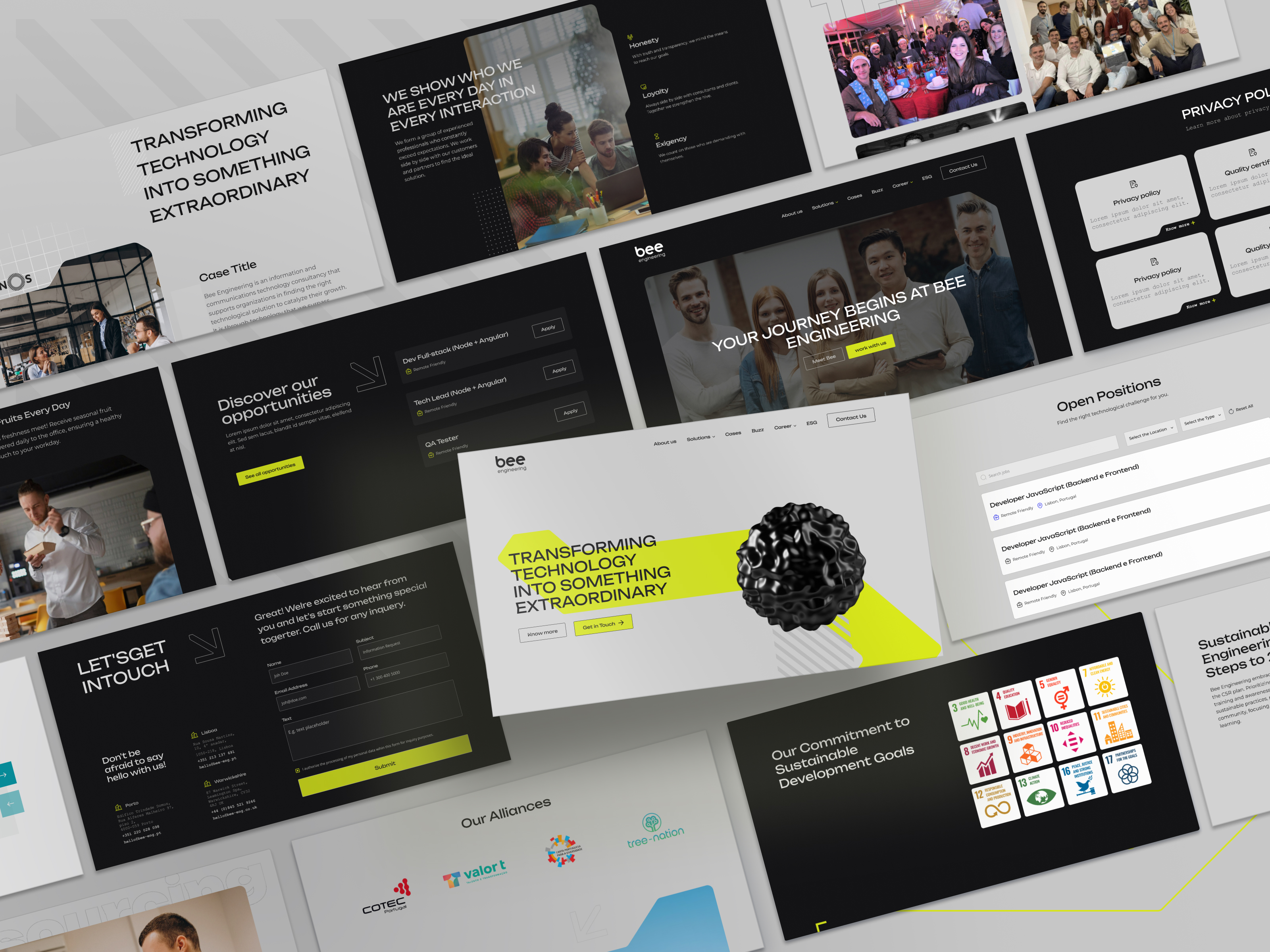
Bee Engineering is a technology consulting firm that was founded in 2010 in France and expanded to Portugal in 2013. Today, it has around 200 specialists dedicated to helping companies with digital transformation, combining innovation and engineering to deliver results.
CHALLENGE
Translating the company’s ambitious artistic and conceptual identity (innovation, creativity, technical excellence, gamification) into a value proposition that is immediately clear to users — people visiting must quickly understand what Bee Engineering offers and why they stand out.
Presenting multiple service divisions (consulting, outsourcing, training, R&D, gamification) distinctly, so each service is identifiable, but all part of a unified brand experience, avoiding confusion.
Building a messaging and visual strategy that is both creative and technically strong, modern and credible, without sacrificing clarity or usability.
.png)
The Market
CONCEPT
The artistic concept chosen was “fluid metal”: something solid, conveying structure and strength, but also fluid, adaptable and mouldable. This analogy mirrors IT professionals — strong in their foundations, yet flexible to client needs.
This balance between rigidity and flexibility reflects Bee Engineering’s way of working: technically disciplined yet creative and responsive.
Visually, this translates to strong contours softened by transitions, abstract metallic surfaces, contrasts of light and shadow for depth, reflection, textures that hint at materiality.
DESIGN
We removed all the previous use of white and light blue. Instead, we focused on sober, darker, metallic tones, with sharp contrast accents to add seriousness and gravitas.
Incorporated industrial elements inspired by signage, technical markings, suggestions of machinery or gears in abstract forms rather than literal depictions.
Abstract shapes with defined edges, metallic texture or brushed/polished surface effects, subtle reflections, gloss, that sort of detail, conveying robustness together with technical elegance.
.png)
DEVELOPMENT
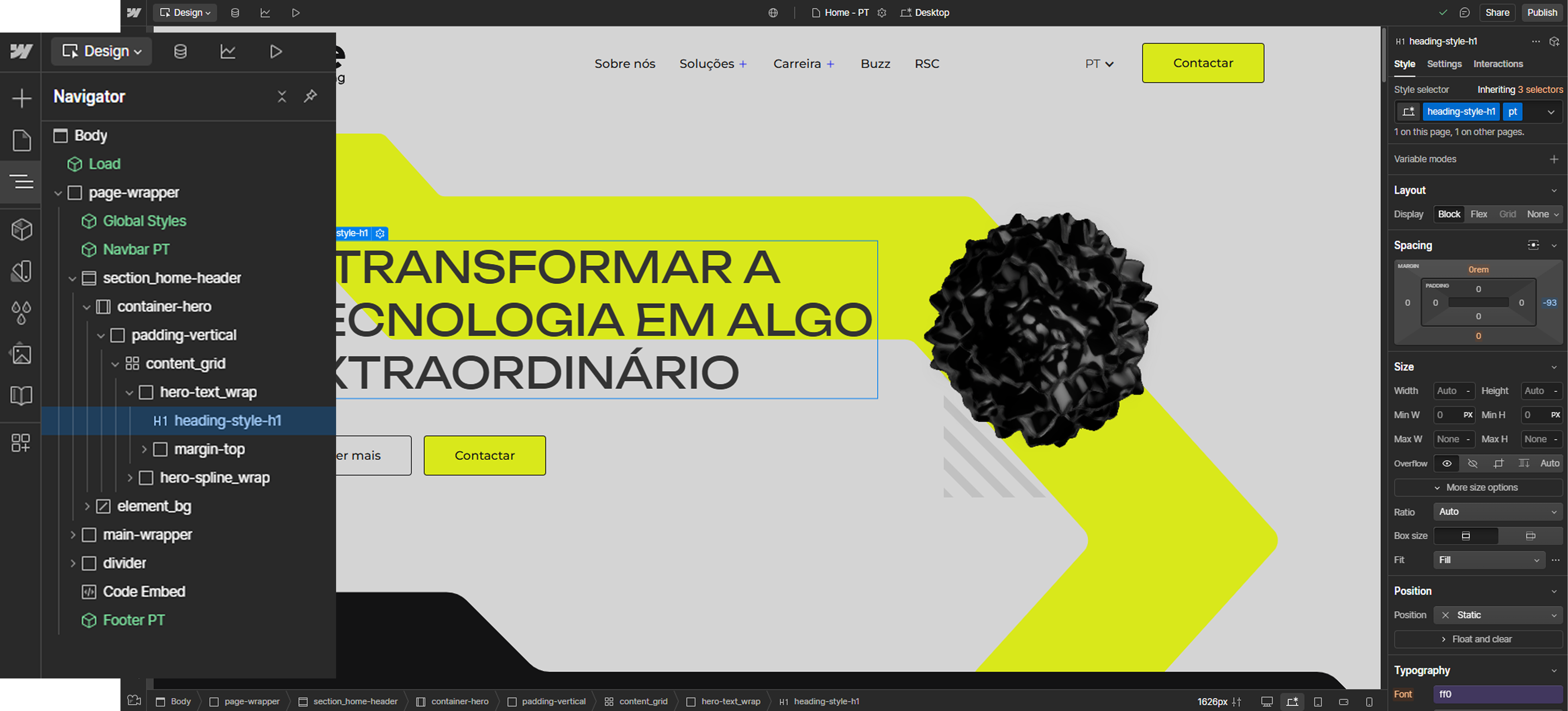
It was a very ambitious development project: lots of animations, multiple API integrations, complex adaptive layouts for responsive across devices.
Adapting unusual metal-like shapes, atypical contours, lighting/reflection effects, transitions — many of these are not naturally supported in pure HTML/CSS, so we used SVG, custom graphics, maybe WebGL or canvas where needed, masks, clip paths, etc.
Ensured responsiveness: that these visual effects and animations work without breaking layout or performance on mobile, tablet, desktop, across browsers.
Built the site so the client has autonomy — can maintain content, update offerings or services, alter small visual parts — making ongoing maintenance more ágil e menos dependente externo.
The Results
The outcome is a strong, distinctive and professional digital image for Bee Engineering, one that communicates both technical capacity and innovative edge.
Prospective clients can now clearly perceive the range of services, what makes Bee different, which leads to more informed decision-making and more leads.
The internal team feels proud and represented — there’s identity, consistência visual, reconciliação entre o que a empresa é e como se mostra.
The website is already generating more qualified leads, more complex project inquiries, and opening up opportunities in R&D or high-level interface design.
Client now enjoys autonomy over content management, allowing fast adaptation of service offerings, reducing maintenance costs and reliance on external help.


.png)